May 23, 2011 in Poll
A Poll: Question of taste

More by accident I produced these three versions of a photo. I will explain you more in a following blog post.
Today I want to ask you:
Which of the three version do you like the most? A WHY would be appreciated?
Please write all your thoughts in the comments.
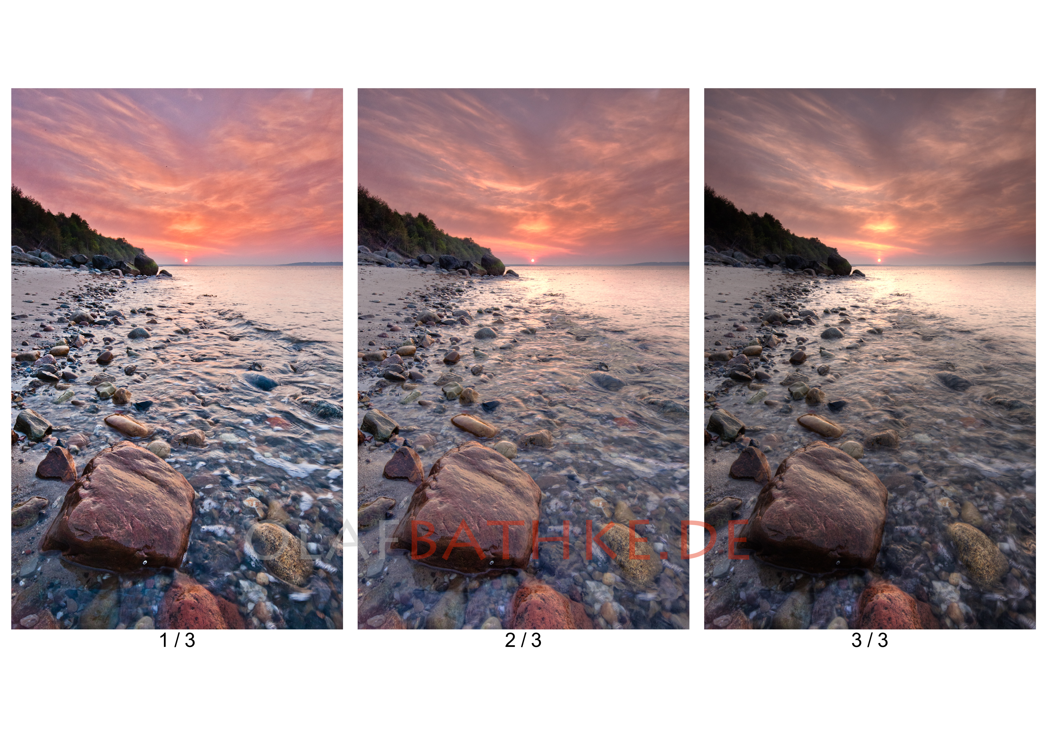
Click on the image for a greater preview.
Related Posts
May 27, 2011
A question of taste
Wooww I am overwhelmed. So many comments. There are not many readers of my English…
July 25, 2011 at 21:25
Yola
J’aime beaucoup la première pour la couleur. Tu fait de très jolie photos. J’aimerais bien en arrivais là, mais j’y suis encore loin 🙁 lol.
June 14, 2011 at 18:28
Terri
Love all the photos, but i prefer picture no 1
June 14, 2011 at 18:33
olaf
Thank You Terri, appreciate your comment.
May 24, 2011 at 15:01
Bernd Limbach
Hi Olaf,
yes, no. 1 looks nice, but it is too nice and so not my favorite.
My preference is no. 3. The trees are quite dark, but do we not expect this for sunset/sunrise when taking a picture against the light source?
Bernd
May 24, 2011 at 14:27
Guido
1/3: unnatural, too much saturation, halos or something like that on top of the trees
2/3 + 3/3 both are good. 2/3 is a little bit more an eyecatcher because of more color saturation
May 24, 2011 at 10:37
fj-07
Hallo Olaf,
auf Anhieb gefällt mir das erste am besten. Die Klarheit der Strukturen und der Glanz auf den Steinen, besoders auf dem Grossen im Vordergrund ziehen meinen Blick an. Das das Wasser und besonders der Schaum klar zu erkennnen ist gefällt mir auch besser als bei den anderen beiden. Bei Bild 1 mag es aber viele geben die genau diese stark hervorgehobenen Strukturen stören.
Bild 2 ist für mich weder Fisch noch Fleisch. Die Kontraste sind mir zu weich, bzw es wirkt etwas matschig in den mittleren Farbtönen.
Bild 3 gefällt mir besser als Bild 2, hier wirken die Schatten wirklich als solche. Leider ist wie jemand oben bemerkt hat der Wald erwas arg dunkel, besonders im Vergleich zu den anderen beiden.
Bei Bild 2 und 3 habe ich das Gefühl das mit dem Wasser “etwas nicht stimmt”. Entweder es sollte so schön klar sein wie im ersten Bild oder aber mehr den Langzeitbelichtungseffekt haben.
Wenn das Wasser in Bild 3 mehr verwischt währe dann müsste ich lange überlegen ob ich mich für 1 oder 3 entscheide. Aber so ist es sicher die 1.
Gruss fj-07
May 24, 2011 at 09:28
Julia
ich mag das erste am liebsten – warum genau kann ich gar nicht sagen, ist so ein gefühl. der blick wandert an den steinen entlang zur sonne, die anderen sind mir etwas zu wischi-waschi 🙂
May 24, 2011 at 09:01
Anja
Das erste natürlich.
May 24, 2011 at 08:10
Josef
Das mittlere ist am ausgewogensten, aber vielleicht auch ein bisschen langweilig. Das linke wirkt etwas künstlich, hat aber eine interessante surreale Atmosphäre. Bei dem rechten säuft der Wald zwar etwas im dunklen ab, allerdings kommt hier der Himmel und die Steine am besten zur Geltung. Das gefällt mir am besten.
LG Josef
May 24, 2011 at 08:03
Andi
I tend to the first one. As the color is more catching and the detail enables the feeling-like-beeing-in-the-scene.
May 24, 2011 at 07:56
Jürgen
I like the first one, its looks more natural to me. In the third one the sky looks to “dirty”
Jürgen
Pingback: OlafBathke
May 23, 2011 at 21:50
Martijn Hollestelle
I prefer the first one. That one has the nicest colours and I also like the texture and the tone of the water more than in the others. And don’t forget to clone out the dust spots.
May 24, 2011 at 08:04
janbpunkt
I agree to you – i prefere the 1st picture too…
May 24, 2011 at 19:19
olaf
It is not final 😉
May 23, 2011 at 20:59
Herry Lawford
Olaf, I tend to prefer No 3. The first one is a little to bright and reveals too much unnecessary detail. More atmosphere in the third one as a result.
May 23, 2011 at 18:02
Ralf Gosch
Hi Olaf,
although I am not a big fan of HDR pictures with toooo much visible HDR “manipulation” I tend to like the first picture the most. There is much more structure in the details and this makes the photo more dynamic.
Ralf Gosch